The strategy watches eleven sectors separately, and each one steps aside on its own schedule when its trend breaks. Sector funds did not exist in 1929, but the underlying data does, so I was able to run the real thing, sector by sector, through the worst decade in American market history.
How I built it
The raw material is Kenneth French’s daily record of 49 American industries, which starts in July 1926, the same data behind our sector quilt. I grouped those industries into the eleven sectors we trade today, equal weighted the industries inside each sector, and gave every sector the strategy’s standard treatment: its own 200-day moving average, the ±1% band, a move to Treasury bills whenever its trend broke, and an equal share of the portfolio. Dividends are included throughout. All eleven sectors had live data in 1929, though some wore different clothes back then. Communication services meant telephone companies, and technology meant business services and electronic equipment, since the computer had not been invented yet.
What happened
The market peaked in September 1929. From that peak, the U.S. market, dividends and all, lost 84% of its value by July 1932 and did not climb back to its 1929 starting line until February 1945, roughly fifteen years later. Against that backdrop, the sector-by-sector strategy never fell more than about 26% below its starting point, and measured from its best interim level to its worst, the deepest decline was about 32%. It crossed back above its starting line in May 1933, while the market was still down 66%, and it finished 1939 up 92% while the market remained deep underwater.
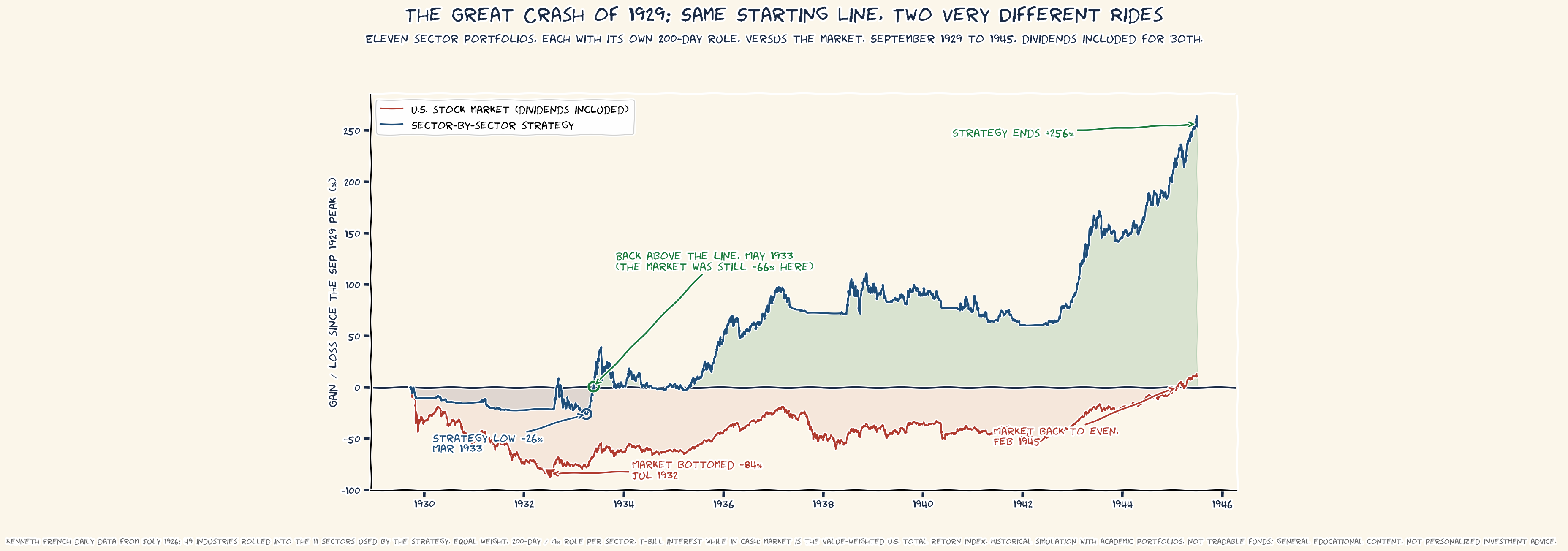
Eleven separate signals, one per sector, took over a third of the market’s pain. Here is the full picture, side by side.
| Approach | Worst point vs the 1929 peak | Back above the starting line |
|---|---|---|
| Sector-by-sector strategy | −26% | May 1933 |
| Total market, dividends included | −84% | Feb 1945 |
Why eleven signals beat one
Two reasons, and they are the same two reasons the strategy exists. First, sectors broke trend at different times, so the portfolio walked to safety in steps rather than waiting for the whole market to confirm. Second, whipsaws diversify. When one sector’s signal gets faked out by a false rally, the others usually do not, so the individual stumbles average into something much gentler than any one of them alone. Add the interest that Treasury bills actually paid in those years and the arithmetic compounds quietly in the right direction through the worst stretch imaginable.
The caveats
These are academic portfolios, not funds anyone could have bought in 1929, and certainly not at zero cost. My grouping of 49 industries into eleven modern sectors is an approximation, and a few of the modern sectors are thin back there, with real estate, telephone, and utilities each resting on a single industry series. Nobody was publishing a daily 200-day moving average in 1930, either. What this test shows is not that anyone could have done this then. It shows that the discipline itself, applied mechanically to the data that existed, held up in the single worst market environment on record.
John