For years I have equal weighted the eleven sector funds in the strategy, giving each corner of the market the same size seat at the table. Why not just let the winners run? If technology has led for a decade, why not simply own more of it?
My answer has always been a hunch, so I decided to test it with real numbers. I used the Kenneth French industry data set from Dartmouth, which tracks the returns of forty nine American industries all the way back to 1926. That gives us close to a hundred years of history, not the fifteen year snapshots you usually see in those colorful sector quilt charts online.
The short answer, and the three percent
Leadership does not last. Over long stretches, the industries that had been the biggest winners tended to cool off, and the ones everybody had given up on tended to recover.
Every year I ranked all forty nine industries by how they had done over the previous ten years, from the worst laggards to the hottest winners. Then I watched what each group did over the following ten years. The industries sitting in the bottom fifth, the forgotten ones, went on to earn about twelve and a half percent a year over the next decade. The ones sitting in the top fifth, the darlings everyone loved, earned only about nine percent a year. That gap, a little more than three percentage points every year for ten years, is the whole story in one number.
Making sure the number holds up
Now, I did not want to fool myself, because that first test has a weakness. When you run it every single year, each ten year window overlaps heavily with the one before it, so those results lean on each other and can look stronger than they really are. So I ran a stricter version that removes the overlap entirely. I simply lined up the clean calendar decades, the 1930s next to the 1940s, the 1940s next to the 1950s, and so on, and asked whether a decade’s leaders faded in the very next decade. Each of those comparisons stands on its own.
The pattern held up. In seven of the eight decade to decade handoffs, the prior winners gave way to the prior laggards. The only exception was the 1980s handing off to the 1990s. When I checked whether that could be luck, the odds came back against it, so this is a real tendency and not a coincidence.
I also checked whether the whole thing hangs on the ten year window, because a result that only works at one length is not much of a result. It does not. When I shortened everything to five years, ranking on the prior five and measuring the next five, the forgotten industries still beat the favorites by about two and three quarters points a year. The one place it falls apart is at very short horizons. Down around three years and shorter, the effect fades and eventually flips, which is simply momentum taking over in the near term. That is exactly why my old monthly test found nothing. Mean reversion here is a slow, patient force measured in half decades, not months.
The technology boom
If I had to point to a single episode, it would be the technology boom of the 1990s. Software compounded at a remarkable thirty seven percent a year through that decade, chips at nearly thirty two, and computer hardware at almost twenty eight. The internet was real and the excitement was understandable. But the prices had already run far ahead of the businesses, and here is what those same industries did in the decade that followed.
| Industry | 1990s (per yr) | 2000s (per yr) | Swing |
|---|---|---|---|
| Software | +37.1% | −6.4% | −43% |
| Chips | +31.8% | −8.9% | −41% |
| Hardware | +27.9% | −4.6% | −33% |
| Telecom | +17.8% | −7.6% | −25% |
The story was true, and the stocks still lost money for ten years, because the crowd had already paid for the story in advance. That is the trap equal weighting is designed to avoid.
The leaders really do rotate
You do not need forty nine academic categories with names like MedEq and LabEq to feel this. I regrouped French’s data into the eleven sectors we actually trade, Technology, Financials, Energy, and the rest, and added the simple average of all eleven as a grey reference box, since that number moves around too. It is an approximation, and the biggest seam is Communication Services, which in French’s data is really just old fashioned telecom, not the internet and media giants that sector holds today. Here is how it all ranked, decade by decade.
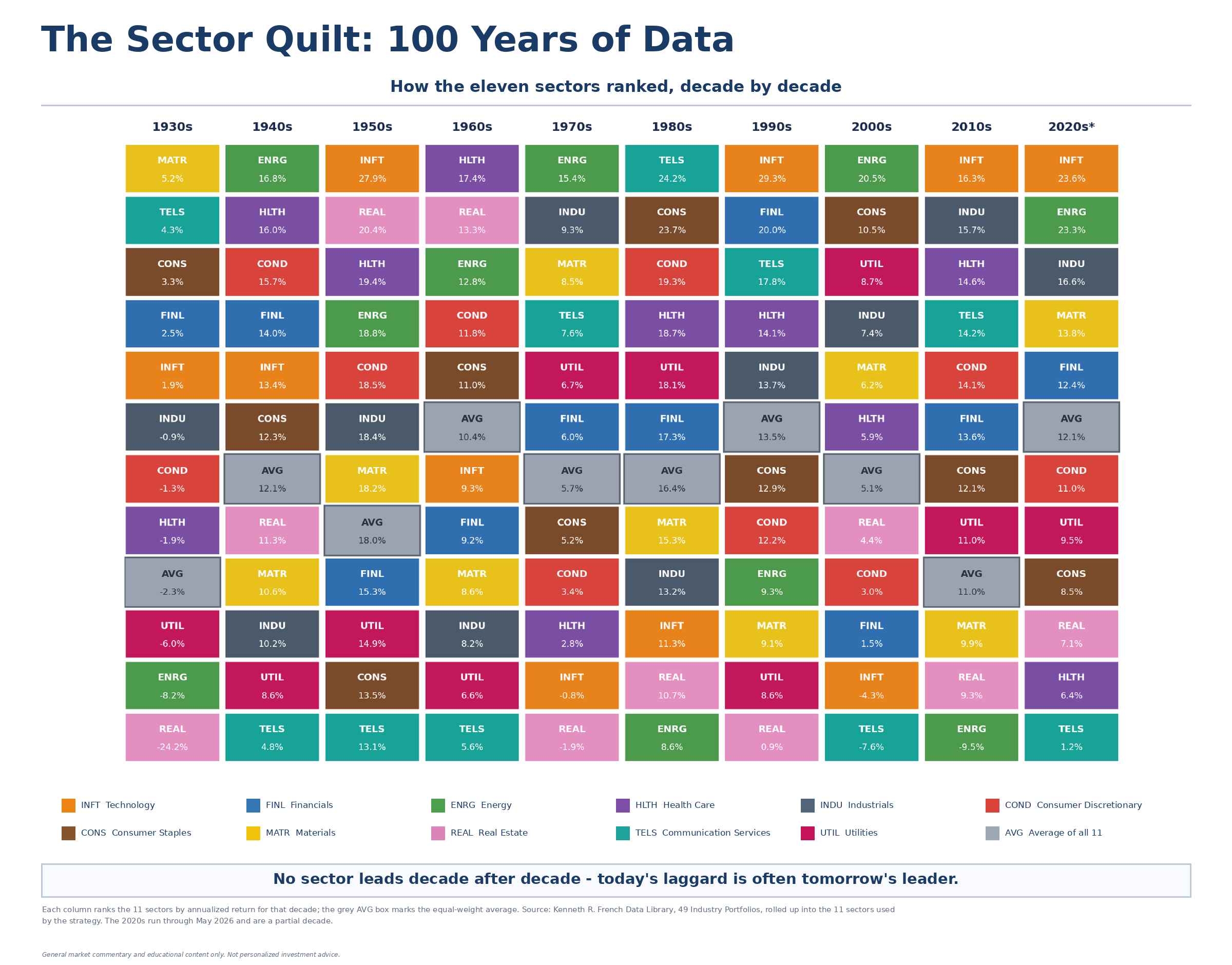
The rotation is all there in the colors. Technology ranked a middling fifth in the 1930s and 1940s, took over as the outright leader in the 1950s, sank all the way to sixth in the 1960s and then tenth of eleven in the 1970s, recovered some ground in the 1980s, roared back to first in the 1990s, collapsed to tenth again in the 2000s after the dot com bust, and has led every decade since, the 2010s and, so far, the 2020s. It is not the only sector that moves. Energy, Real Estate, and Communication Services all bounce around just as hard. Technology just happens to be the one on top right now.
That last part is the wrinkle in this whole piece. Every other time technology has taken the top spot, it eventually gave it back. This time, three decades into a run and still accelerating, from about 16% a year in the 2010s to about 24% a year so far in the 2020s, it has not yet. I do not think that makes technology special. I think it makes this decade’s test incomplete. Every prior leader looked unstoppable for a while too, and I would bet on this pattern continuing rather than betting it just broke.
You will also notice the gap between winners and losers is smaller here than in the forty nine industry version. That is exactly what you would expect, rather than a flaw in the sector level test. Each of these eleven sectors is already a basket of several French industries, so an unusually hot or cold industry gets averaged in with calmer neighbors before the sector level comparison even starts. Diversification inside the bucket blunts the extremes on both ends, which is the same reason the strategy diversifies across sectors in the first place. It is a smaller effect, measured plainly, and still a real one.
This eleven sector test equal weights the industries inside each sector, since that is what French’s data allows. The actual funds we hold, XLK and the rest, do not work that way. Inside each one, the fund is cap weighted, so a handful of the largest holdings drive most of the return. Equal weighting across our eleven sectors caps how much any single sector can dominate the whole portfolio. It does not, by itself, do anything about concentration inside a sector. That is a real and separate risk.
What this means for how we invest
One caution before you take this anywhere. The pattern is far too slow and too noisy to tell you what to buy this month or even this year, so it makes a poor trading signal. Go on holding what you hold.
What the century of history does support is the quiet discipline behind equal weighting. We give up on guessing which sector will own the next ten years, because history says nobody owns it for long. By giving each sector the same starting weight, we keep from letting yesterday’s champion quietly grow into tomorrow’s oversized risk. No corner of the market gets to become the whole portfolio just because it has been winning.
That tension, whether the current AI driven run breaks the pattern or eventually joins it, is exactly what the market is wrestling with right now. The New York Times noted recently that “huge sums being funneled into A.I. infrastructure have bolstered returns in a vast range of stocks around the world,” and that “capturing those gaudy A.I. returns while diversifying sufficiently to minimize the pain of potentially severe downturns is becoming a significant challenge,” adding a blunt warning: “if the enormous expectations for A.I. aren’t met, those remarkable portfolio returns could suddenly vanish.” That is the whole argument for equal weighting, stated by someone else, in someone else’s words.
The bottom line
Sector leadership is sticky in the short run and unstable in the long run. Chasing last month’s winner is a fool’s errand, but assuming this decade’s champion will also win the next one is its own kind of mistake. Equal weighting across sectors is my way of respecting that uncertainty. It is a refusal to let the market’s current favorite become my single largest worry, and it predicts nothing at all.
Go back to that one and a half point a year gap between the best and worst sector groups. It amounts to a good deal more than a historical curiosity sitting in a spreadsheet. Every rebalance back to equal shares quietly trims the winners and tops up the laggards, which is the same trade that has been worth roughly a point and a half a year in this data. That is the engine underneath equal weighting, rather than a separate idea from it.
John